Introducing Ridgeline Plots: A Visual Feast for Data Exploration
In the world of data visualization, understanding the distribution of data across different categories is crucial. Ridgeline plots, also known as joyplots, offer an elegant and effective way to visualize these distributions. This blog post will guide you through creating ridgeline plots in Python using seaborn and matplotlib.
What are Ridgeline Plots?
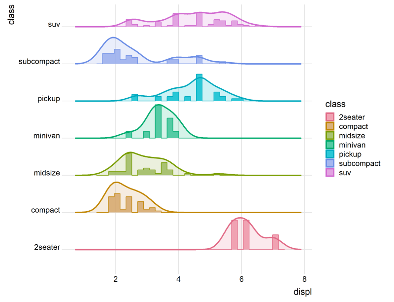
Ridgeline plots display the distribution of a numerical variable across multiple categories by plotting density estimates (or histograms) that are stacked vertically and slightly overlapped. This creates a “ridgeline” effect, making it easy to compare the distributions of different groups.
These plots are particularly useful for:
- Comparing distributions: Quickly identifying differences in shape, spread, and central tendency across categories.
- Identifying patterns: Spotting trends and shifts in data that might be obscured in other visualization types.
- Enhancing visual appeal: Creating engaging and informative graphics.
Creating Ridgeline Plots in Python
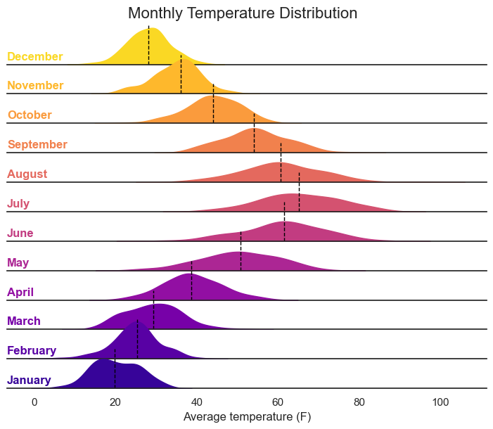
Let’s illustrate how to create ridgeline plots using a simulated dataset of monthly temperature distributions. We’ll utilize the seaborn and matplotlib libraries, which are essential for this task.
First, ensure you have the necessary libraries installed:
import matplotlib.pyplot as plt
import seaborn as sns
import pandas as pd
import numpy as np

np.random.seed(123)

months = ['January', 'February', 'March', 'April', 'May', 'June',
          'July', 'August', 'September', 'October', 'November', 'December']
n = 100

data = pd.DataFrame({
    'month': np.repeat(months, n),
    'temperature': np.concatenate([
        np.random.normal(20, 5, n),    # January
        np.random.normal(25, 6, n),    # February
        np.random.normal(30, 7, n),    # March
        np.random.normal(40, 8, n),    # April
        np.random.normal(50, 9, n),    # May
        np.random.normal(60, 10, n),   # June
        np.random.normal(65, 10, n),   # July
        np.random.normal(62, 9, n),    # August
        np.random.normal(55, 8, n),    # September
        np.random.normal(45, 7, n),    # October
        np.random.normal(35, 6, n),    # November
        np.random.normal(28, 5, n)     # December
    ])
})

data['month'] = pd.Categorical(data['month'], categories=months, ordered=True)

plt.figure(figsize=(10, 8))
sns.set_theme(style="white", rc={"axes.facecolor": (0, 0, 0, 0)})

g = sns.FacetGrid(data, row="month", hue="month", aspect=15, height=0.5, palette="plasma", row_order=months[::-1])

g.map_dataframe(sns.kdeplot, "temperature", fill=True, alpha=1)

def add_median(data, **kwargs):
    median = data['temperature'].median()
    plt.axvline(median, color='black', linestyle='--', linewidth=1)

g.map_dataframe(add_median)

def label(data, color, label):
    ax = plt.gca()
    ax.text(0, 0.2, label, fontweight="bold", color=color, ha="left", va="center", transform=ax.transAxes)

g.map_dataframe(label)

g.set_titles("")
g.set(yticks=[])
g.despine(left=True)
g.fig.subplots_adjust(hspace=-0.25)
g.set_axis_labels("Average temperature (F)", "")
g.fig.suptitle("Monthly Temperature Distribution", fontsize=16)

plt.show()
This python code should create the following chart: