Introducing Ridgeline Plots: A Visual Feast for Data Exploration
In the realm of data visualization, the quest for insightful and aesthetically pleasing representations is ongoing. Enter ridgeline plots, a powerful tool for displaying distributions across multiple categories. This blog post will explore what ridgeline plots are, how to create them in R using the ggplot2 and ggridges packages, and why they can be a valuable addition to your data analysis toolkit.
What are Ridgeline Plots?
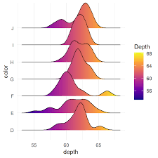
Ridgeline plots, also known as joyplots, are a type of visualization that displays the distribution of a numerical variable for several groups. They achieve this by plotting density estimates (or histograms) for each group, stacked vertically and slightly overlapping. This overlapping effect creates a “ridgeline” appearance, hence the name.
These plots are particularly effective for:
- Comparing distributions: Quickly observe how distributions vary across different categories.
- Identifying patterns: Spot trends and shifts in data that might be obscured in other visualization types.
- Enhancing visual appeal: Create visually engaging and informative graphics.
Creating Ridgeline Plots in R
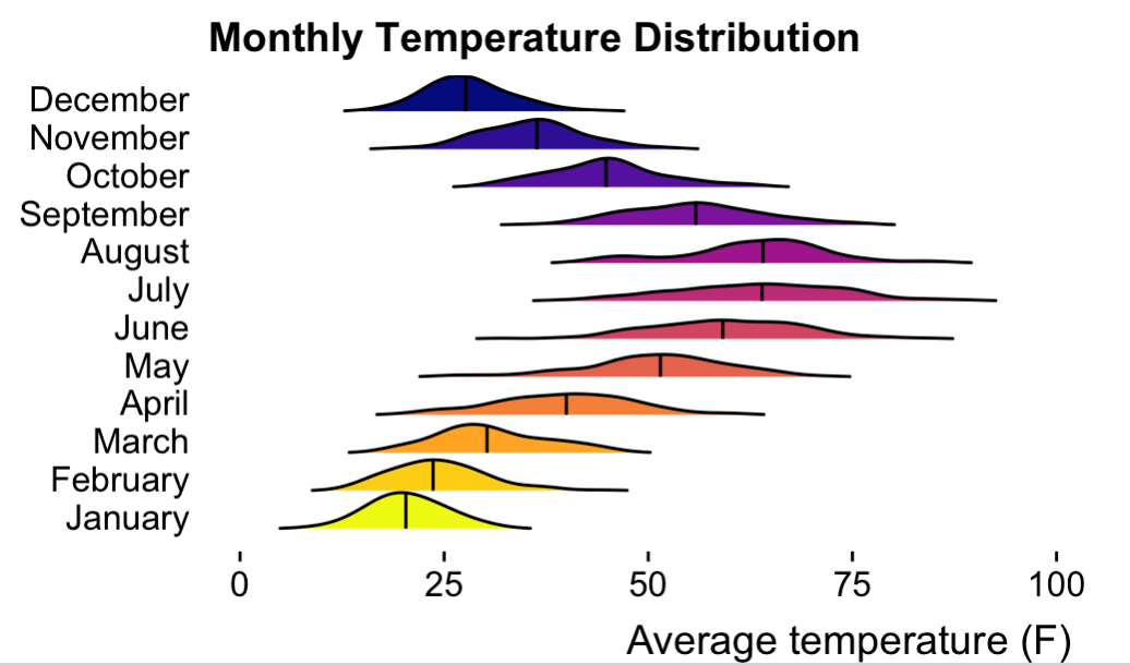
To illustrate how to create ridgeline plots, let’s use a simulated dataset of monthly temperature distributions. We’ll utilize the ggplot2 and ggridges packages, which are essential for this task.
library(ggplot2)
library(ggridges)

set.seed(123)

months <- month.name
n <- 100

data <- data.frame(
  month = rep(months, each = n),
  temperature = c(
    rnorm(n, mean = 20, sd = 5),    # January
    rnorm(n, mean = 25, sd = 6),    # February
    rnorm(n, mean = 30, sd = 7),    # March
    rnorm(n, mean = 40, sd = 8),    # April
    rnorm(n, mean = 50, sd = 9),    # May
    rnorm(n, mean = 60, sd = 10),   # June
    rnorm(n, mean = 65, sd = 10),   # July
    rnorm(n, mean = 62, sd = 9),    # August
    rnorm(n, mean = 55, sd = 8),    # September
    rnorm(n, mean = 45, sd = 7),    # October
    rnorm(n, mean = 35, sd = 6),    # November
    rnorm(n, mean = 28, sd = 5)     # December
  )
)

data$month <- factor(data$month, levels = months)

ggplot(data, aes(x = temperature, y = month, fill = month)) +
  geom_density_ridges(
    scale = 0.95,
    rel_min_height = 0.01,
    quantile_lines = TRUE,
    quantile_fun = function(x, ...) median(x)
  ) +
  scale_fill_viridis_d(option = "plasma", direction = -1) +
  labs(
    x = "Average temperature (F)",
    y = NULL,
    title = "Monthly Temperature Distribution"
  ) +
  theme_ridges(grid = FALSE) +
  theme(legend.position = "none")
The above code in R will create the following image: