Introducing Spatial Charts
Spatial charts are a powerful way to visualize geographic data, allowing for insightful analysis of regional trends, patterns, and distributions. In R, spatial charts can be created using libraries like ggplot2, sf, and USAboundaries, among others.
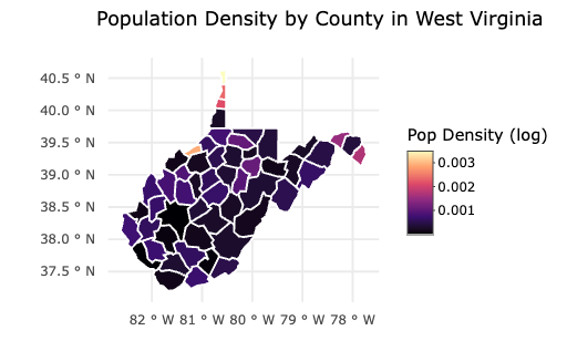
Here is one I created in R!
Why Use Spatial Charts?
Geographical Insights: Easily identify trends that vary across regions.
Enhanced Data Interpretation: Spot high-density areas, hot spots, or outliers.
Interactive Potential: Use tools like plotly to make maps dynamic and exploratory.
How to make them
library(USAboundaries)
library(tidyverse)
library(sf)
library(ggplot2)
library(plotly)

west_virginia_counties <- us_counties() %>%
  select(geoid, name, state_abbr, geometry) %>%
  filter(state_abbr == "WV") %>%
  mutate(population = runif(n(), 5000, 1000000)) %>%
  mutate(pop_density = population / as.numeric(st_area(geometry)))

wv_map <- ggplot() +
  geom_sf(data = virginia_counties, aes(fill = log1p(pop_density), text = name), color = "white") +
  scale_fill_viridis_c(option = "magma", name = "Pop Density (log)") +
  labs(
    title = "Population Density by County in West Virginia",
    subtitle = "Log-transformed for better visualization",
    caption = "Source: USAboundaries R package"
  ) +
  theme_minimal()

ggplotly(wv_map, tooltip = "text")
Conclusion
Spatial charts provide an intuitive way to analyze data across regions, making them ideal for mapping population densities, crime rates, or other geospatial statistics. With R’s powerful visualization libraries, creating these maps is both accessible and insightful.