Spatial Project of the U.S.
Analyzing Traffic Accidents Across the U.S.
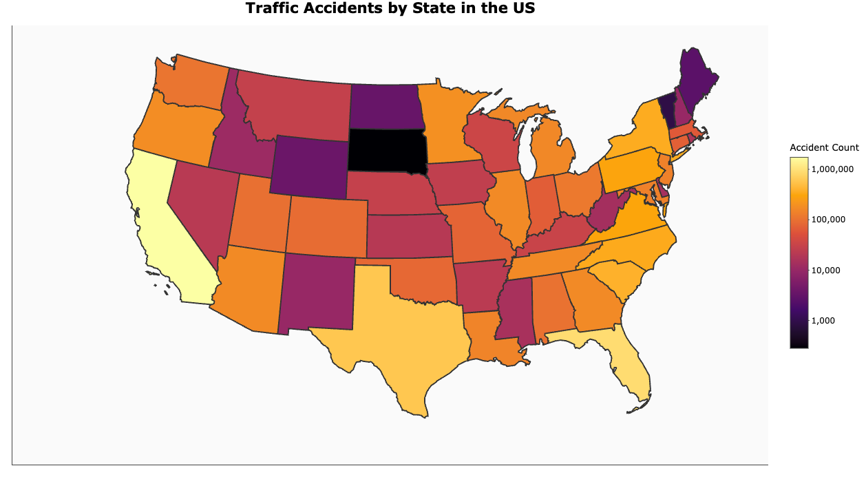
In this project, we delved into the spatial distribution of traffic accidents across the United States. Using a dataset of US accidents, we created an interactive map that visualizes the accident count for each state. The map employs a log10 scale to better represent the wide range of accident counts, from thousands to millions.
Key Analytical Insight
The map clearly illustrates the significant variation in traffic accident counts across different states. Larger, more populous states, particularly those along the coasts and in the Southeast, tend to exhibit higher accident counts. This is likely due to a combination of factors, including higher population density, increased traffic volume, and potentially longer average commute distances.
Conversely, states in the Midwest and Mountain regions generally show lower accident counts. This could be attributed to lower population density, less traffic congestion, and potentially different driving habits. However, it’s important to note that even with lower overall counts, the rate of accidents per capita might tell a different story.
The use of a log10 scale is crucial here. Without it, the vast differences in accident counts would make it difficult to discern patterns in states with lower numbers. The interactive nature of the plot, achieved through plotly, allows users to hover over each state and view the exact accident count, enhancing the exploratory analysis.
There is more work to come! I plan on expanding on this analysis to display the counties for each state and display a heatmap of the accidets across the country.
R Code Used
library(USAboundaries)
library(tidyverse)
library(sf)
library(ggplot2)
library(viridis)
library(data.table)
library(scales)
library(ggrepel)
library(plotly)

accidents <- fread("US_Accidents.csv", select = c("State", "Severity", "Start_Lat", "Start_Lon"))
states <- us_states()
accidents <- accidents %>% mutate(State = toupper(State))

accident_counts <- accidents %>%
  group_by(State) %>%
  summarise(accident_count = n(), .groups = "drop")

map_data <- states %>%
  left_join(accident_counts, by = c("state_abbr" = "State"))

map_data <- map_data %>%
  filter(!state_abbr %in% c("HI", "AK"))

map_data <- map_data %>%
  mutate(centroid = st_centroid(geometry),
         centroid_x = st_coordinates(centroid)[, 1],
         centroid_y = st_coordinates(centroid)[, 2])

base_map <- ggplot(map_data) +
  geom_sf(aes(fill = accident_count,
              text = paste(name, "<br>Accident Count:", accident_count)),
          color = "gray20", size = 0.2) +
  scale_fill_viridis_c(
    option = "inferno",
    na.value = "gray90",
    trans = "log10",
    breaks = trans_breaks("log10", function(x) 10^x),
    labels = comma_format(accuracy = 1)
  ) +
  theme_void() +
  labs(
    title = "Traffic Accidents by State in the US",
    fill = "Accident Count",
    caption = "Data Source: [Your Data Source], [Date of Data]"
  ) +
  theme(
    legend.position = "right",
    plot.title = element_text(hjust = 0.5, size = 16, face = "bold"),
    legend.title = element_text(size = 10, face = "bold", margin = margin(b = 5)),
    legend.text = element_text(size = 9),
    legend.key.size = unit(0.7, "cm"),
    plot.caption = element_text(hjust = 0, size = 10, color = "gray50", margin = margin(t = 10)),
    panel.background = element_rect(fill = "gray98", color = NA)
  ) +
  coord_sf(crs = st_crs(2163), xlim = c(-2500000, 2500000), ylim = c(-2300000, 730000)) +
  guides(fill = guide_colorbar(barheight = 10, barwidth = 1))

label_layer <- geom_text_repel(aes(x = centroid_x, y = centroid_y, label = state_abbr),
                               size = 3,
                               color = "gray30",
                               box.padding = unit(0.5, "lines"),
                               point.padding = unit(0.3, "lines"),
                               segment.color = "gray50", segment.size = 0.3,
                               min.segment.length = 0,
                               max.overlaps = 20)

final_plot <- base_map + label_layer

plotly_plot <- ggplotly(final_plot, tooltip = "text")

plotly_plot